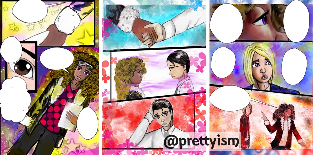
Printed books that is. I personally love love ebooks and webtoons. But there is a certain beauty to the printed page, how the parts compromise a greater whole. I don’t think one format is actually better than the other, but I fell in love with manga first.
Here are some not very well organized thoughts upon looking at Vampire Knight Volume 1. You can preview the manga on Viz’s site (I’m not affiliated with the company)
Page 1:
- I am looking through the characters eyes. I feel small.
- negative space creates a mystery.
- layout draws my eyes downward.
Pages 2 & 3.
- flashy, in a good way.
- splash pages with cool beautiful characters. I want to know who they are.
- lines and space continue to guide my eyes to the next page.
Page 4:
- image of a small girl, she looks vulnerable. I’m worried about her. Why is she alone outside at night? In the snow?
- negative space, like something is lurking.
- more diagonal lines guiding my eyes to the next page.
Page 5:
- diagonal lines emphasize the tension of the page.
- black areas also help to pull the my eyes down and over to the next page.
- This page moves more quickly than the the previous pages.
Well I could go in but I won’t. While my art is not on the same level as VK, there are a lot of diaganols.